
Design tokens are increasingly used in the design and development of digital products such as web shops and websites. But what exactly are design tokens? And why are they so valuable, especially in larger, complex projects?
What are Design Tokens?
Design tokens are standardised variables that capture design features, such as colours (primary-color), fonts (heading-font) and margins (spacing-small). Instead of applying these styles manually in each button, title or section, capture them centrally as tokens. This not only makes your design consistent, but also much more manageable and scalable.
Think, for instance, of a primary colour used in dozens of places in a webshop. By defining this colour as a token, you only need to make an adjustment in one place to change the colour site-wide, which is ideal for a rebranding or customer-specific adjustment.
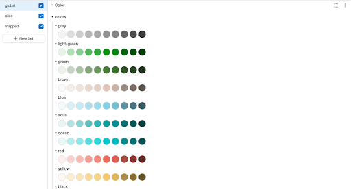
In your token definition, you use a number of levels to capture those colours. Tokens are often classified into three categories:
Global tokens
These are the most primitive values, usually based on a universal scale. They are not context-specific and can be used anywhere in the design. (blue-700)Alias tokens
Alias tokens refer to a specific context or function within the interface. They link global values to a meaningful role. (cta-bg-color)Component-specific tokens
These tokens are even more specific and apply only within a particular component. They make it clear that a token is only used for that component and often give a name that indicates the function within that component. (button-cta-background-color)Tip: By following this hierarchy, you can easily modify tokens in one place (e.g. the global or alias levels) and this will automatically feed through to all components that depend on them.
Atomic Design and Design Tokens
Design tokens fit perfectly with the principle of Atomic Design, where an interface is built from small, reusable components. This combination makes designing and developing consistent interfaces much easier.
Atoms
These are the smallest building blocks, such as HTML elements, colours or fonts. They have limited meaning on their own, but form the basis for more complex components.
Examples:
Molecules
Molecules are created by combining atoms into a small functional unit. They are more meaningful because the combination performs a specific task.
Example: A form consisting of a label, an input field and a button.
Organisms
Organisms are larger components composed of multiple molecules that form a distinct part of the interface.
Examples: a header with logo, navigation and search field; or a product grid repeating the same product-item molecule.
Templates / Pages
Templates combine organisms and other components into a complete page as a blueprint. They show how components work together in a real context and make it easy to place dynamic content without changing the structure.
Design Tokens linked to Atomic Design
Global tokens are often atoms: colours, fonts, spacing.
Alias tokens are molecules: they give a global value a meaningful role within a context (e.g.
cta-bg-color).Component-specific tokens are organisms: they define styling specific to a component, such as
button-cta-background-color.
Design tokens form the "atomic" basis of this system. Suppose you use a button component that references tokens for colour, typography and spacing. Do you modify a token? Then automatically change the style of all buttons built based on this token, without having to edit individual components. Of course, you will probably use different tokens for your primary and secondary button styles.
Case study: Magento & Shopware
At Ecomwise, we apply this principle daily in our base environments for Magento and Shopware. In Figma, we build a flexible design system that serves as a starting point for customer-specific projects. In it, we record all style elements as tokens: from colours and fonts to buttons and navigation components.
As soon as the design is approved, we export the tokens as variables to be used directly in the front-end code. This makes the translation from design to development lightning-fast and error-free.
What does it deliver?
Using design tokens offers clear advantages, especially for larger or complex B2B websites. But it also requires a structured approach within your team. Below, we list the most important benefits and points of attention for you.
- Consistent style and look: Design tokens ensure that colours, typography and components are applied exactly the same on every page, regardless of who is working on it.
- Faster development and fewer errors: Because tokens are automatically reflected in all parts of the design and code, you end up saving time on adjustments as well as avoiding manual errors.
- Better collaboration between design and development: Design tokens are the connecting link between design and code. You prevent misunderstandings and turn the design into directly applicable output for developers.
- Scalable as it grows and evolves: New features, designs or customer requirements? Thanks to the reusable nature of tokens, you easily scale with them without rebuilding the entire design.
What does working with design tokens require from your team?
Design tokens provide many benefits, but there are also some concerns that are important to take into account in your approach:
- A well-thought-out structure: A well-designed token system requires clear naming and a logical hierarchy. This requires some upfront thinking.
- Investment at the start: It takes time to set up your design tokens and integrate them into your design and development workflow. But that investment pays for itself twice over later.
- Team alignment: Everyone, from designer to developer, needs to know how to work with tokens. Clear agreements and documentation help.
With the right approach, design tokens actually reduce errors, speed up deliveries and increase flexibility for changes. Especially in larger or ongoing B2B projects, they make a noticeable difference.
Want to know more?
Want to dive deeper into the world of designer tokens? Then check out this handy introduction to designtokenscourse.com. Or contact us if you have any questions about this.


") EN
EN  NL
NL  MK
MK